Prompting ERNIE-Image for Dense Typography
ERNIE-Image is an 8B DiT that was trained with posters, CJK signage, and multi-panel comics in the corpus. Here is how you write prompts that actually render the words you asked for.
Most text to image models treat typography as a decorative afterthought. ERNIE-Image was trained the other way around. The 8B DiT, released under Apache 2.0 by Baidu, posts a LongTextBench score of 0.9733 and hits a GenEval of 0.8728 when you turn on the prompt enhancer. Those numbers translate into a model that will render a five line block of Chinese text on a movie poster, or a bilingual menu card with English subtitles under Simplified Chinese dish names, without the usual melted glyph failure modes you see from general purpose models.
The tradeoff is that ERNIE-Image rewards you for being explicit. If you prompt it like you would prompt a generalist image model, you lose most of the typography advantage. Write your prompts with hierarchy, glyph counts, and placement language baked in, and the output quality jumps visibly.
The four section prompt
For any poster, menu, or layout heavy piece, structure the prompt into four parts. First, the scene and style. Second, the exact strings you want rendered, in quotes. Third, the layout and hierarchy. Fourth, the palette and camera treatment. Keep each section a single sentence.
Here is a working pattern for an event poster:
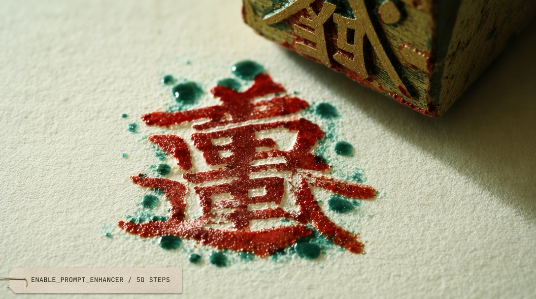
01A minimalist concert poster for an electronic music festival, flat vector style.02Title text reads "东方之声" in large bold Simplified Chinese, subtitle "EASTERN SOUND 2026" in thin English caps, date line "March 14 to 16" below.03Title centered upper third, subtitle 40 percent smaller directly under title, date line bottom fifth, two centimeter margin on all edges.04Deep navy background, acid green accent on the title, white on subtitle and date, soft grain texture, no photograph.
Feed that through the endpoint and you get back a poster where the Chinese characters render cleanly, the English cap line holds its geometry, and the date line lives where you asked it to live.
Why the prompt enhancer matters
The enable_prompt_enhancer: true flag runs your input through an ERNIE rewriter before the DiT pass. The enhancer fills in things the model needs that you did not say. It infers kerning intent from the layout description, adds explicit glyph counts when you have a quoted string, and tightens the color spec when you gave it a single tone. The 0.8728 GenEval figure is measured with the enhancer on. Without it, the same model scores meaningfully lower on text fidelity. Turn it on by default.
There is one case to turn it off. When you are running a LoRA you trained yourself on a specific typography style and you already know exactly what you want, the enhancer will sometimes drift your prompt away from the LoRA anchor. Use the fal-ai/ernie-image/lora endpoint with the enhancer off and your tuned strings intact.
Calling the endpoint
Here is the minimal TypeScript call with the enhancer on and a 16:9 target:
01import { fal } from '@fal-ai/client';0203fal.config({ credentials: process.env.FAL_KEY });0405const result = await fal.subscribe('fal-ai/ernie-image', {06 input: {07 prompt: [08 'A minimalist bilingual cafe menu card, flat design.',09 'Header reads "春日咖啡" in bold Simplified Chinese, subheader "Spring Coffee Menu" in thin English.',10 'Four drink items listed below in two columns, each with a Chinese name and an English translation.',11 'Soft cream background, muted jade typography, thin divider lines, no photograph.',12 ].join(' '),13 image_size: 'portrait_4_3',14 num_inference_steps: 50,15 enable_prompt_enhancer: true,16 },17 logs: true,18});1920console.log(result.data.images[0].url);
Hierarchy language the model actually listens to
ERNIE-Image responds well to percentage language and to relative positioning. "Subtitle 40 percent smaller" will give you a subtitle 40 percent smaller. "Date line bottom fifth" will put the date line in the bottom fifth of the canvas. "Two centimeter margin" is interpreted as a proportional margin, not a literal measurement, and holds surprisingly well across aspect ratios.
Words that confuse the model and you should avoid. Vague scale words like small, medium, and large. Direction without anchor, such as "above" without saying above what. And conflicting alignment, like asking for a centered title and a left flushed title in the same prompt.
Glyph count specification
The single highest impact move you can make for dense CJK text is to put the exact string in quotes. The model counts characters inside the quotes and plans the layout around that count. If you write "some Chinese title about spring" it will invent a string and often produce noise. If you write "春日咖啡" it will render those four characters. This is the mechanism behind the LongTextBench score. You can quote strings up to roughly 60 characters for Simplified Chinese and up to roughly 120 characters for English before fidelity starts to slip.
When Turbo is and is not the right call
The fal-ai/ernie-image/turbo endpoint at $0.01 per megapixel runs 8 steps instead of 50. For typography heavy work, Turbo is the wrong choice unless you are iterating. The 42 step difference is exactly where the model refines glyph edges. If you are drafting layouts, use Turbo. When you lock in a prompt you plan to render at final size, go back to the 50 step endpoint for the production pass.