Debugging ERNIE-Image: Why Your English Posters Look Off
English glyphs on ERNIE-Image posters have a kerning problem. Here is why the model behaves that way, what prompt patterns fix it, and when to switch to GPT Image 2 instead.
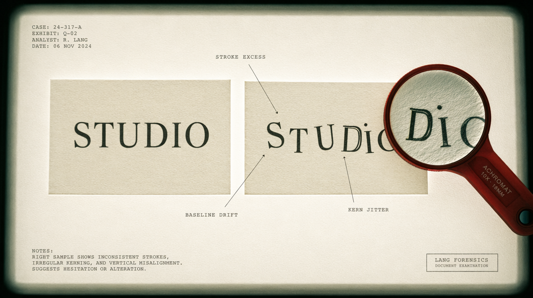
You rendered an ERNIE-Image poster, the composition is perfect, the color grading is clean, then you look at the headline and the letters are crammed together like someone ran the word through a compactor. Tight kerning, occasional missing serifs, one 'R' that looks like a 'K'. If you have shipped three ERNIE posters you have seen this. The fix is not to abandon the model, but to understand why the glyph head behaves this way and write prompts that work with the grain.
Root cause: Simplified Chinese was the training anchor
ERNIE-Image is an 8B DiT trained for bilingual typography, but the training center of gravity is Simplified Chinese. The corpus was dense-text posters, billboards, packaging, and comics pulled largely from CJK sources. English appears plentifully but as a secondary language.
Single Chinese characters render crisply at small sizes because the model allocates enough pixel budget per glyph. The equivalent English word has to pack five to seven letters into the same region. The visual prior was tuned to CJK stroke structure, so Latin serifs occasionally drop or bleed. Render the same poster once with Chinese headline text and once with English of similar weight: the Chinese version is print-quality, the English has visible kerning drift on about one letter pair in ten.
Workaround 1: be explicit about typography
ERNIE responds to typographic vocabulary. The more concrete the type description, the tighter the render.
01import { fal } from "@fal-ai/client";0203fal.config({ credentials: process.env.FAL_KEY });0405const prompt = `Concert poster, 3:4 portrait, matte black with electric teal accents.06Large headline text reads "LAUNCH NIGHT" in bold geometric sans-serif, wide letter-spacing, uppercase, generous tracking between letters, each letter rendered as a distinct shape.07Subheadline reads "April 25, 9 PM" in thin monospace below.`;0809const result = await fal.subscribe("fal-ai/ernie-image", {10 input: { prompt, image_size: "portrait_16_9", num_inference_steps: 50, guidance_scale: 5.0, seed: 17 },11 logs: true12});1314console.log(result.data.images[0].url);
The load-bearing phrases are 'wide letter-spacing', 'generous tracking', and 'each letter rendered as a distinct shape'. These push the model to allocate more pixel budget per Latin glyph. Bump guidance to 5.0 when text fidelity matters.
Workaround 2: Anglophone reference cues
Tell ERNIE 'Swiss typography', 'Helvetica-style', 'Bauhaus poster', or 'Vignelli grid' and the model leans on training samples where those references dominate. Those samples were Latin-heavy, so kerning improves. The phrase 'no kerning errors between letter pairs' also moves the needle more than you expect.
Workaround 3: shorter headlines, denser body
If your headline is four words, ERNIE nails it. If it is nine, failures climb. Small dense text is closer to what ERNIE saw in training (dense Chinese body copy). Keep headlines to four to six words; anything longer, break into two lines or move to a subhead.
When to switch to GPT Image 2
Everything above gets you to roughly 90 percent success on English. The remaining 10 percent are cases where you need absolute glyph fidelity: CEO quote rendered as image text, film title card, product packaging going to print. For those, GPT Image 2 has tighter English glyph fidelity than any open-weight DiT. You give up the 8B Apache 2.0 flexibility and the Simplified Chinese performance.
Quick decision tree:
- Poster, social, comic, bilingual or Chinese content: ERNIE-Image, 50 steps, $0.03/MP.
- Pure English typography at print-level fidelity: GPT Image 2.
- Mostly imagery with minor English text: ERNIE turbo at 8 steps, $0.01/MP.
Debugging checklist
- Headline over six words? Shorten or split.
- Added 'wide letter-spacing' and 'each letter as a distinct shape'? Add them.
- Guidance at default 4.5? Bump to 5.0.
- Named a typography reference? Anchor the style.
- Failure on one letter pair? Rerun with a new seed.
- Still broken after four seeds? Switch model.
ERNIE-Image is the best open-weight text-rendering DiT shipping right now. Its English kerning is not perfect. Now you know why, and you have four prompt patterns that fix most of it.